There are situations where a buttons style would need to be updated to meet with approved compositions or branding for a campaign page, intermediate page, or any other type of page template. In this tutorial, we will guide you on how to apply the available styles for buttons within Sitecore based on which site you may be working with. Each site may have different styles to choose from to stay with the styling guidelines that have been put into place. However, it is best to stick within the site’s folder tree when selecting a style for a button so that the site is consistent.
Before we go into detail on how to apply a style to a button, it is important to note where the ‘Styles’ folder is located for each site so that when you do apply a specific style you know where to go to in the Component Properties of a rendering in the Experience Editor.
Introduction to Where the ‘Styles’ folder is located per site.
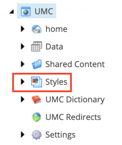
UMC and ResourceUMC:
- Once you are in the Content Editor, select ‘UMC’ from the file tree and you will see the ‘Styles’ folder item.
UMNews:
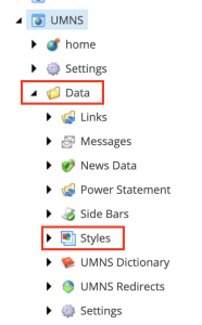
- Once you are in the Content Editor, select ‘UMNS’ from the file tree.
- Select ‘Data’ folder item in the file tree and you will see the ‘Styles’ folder item.
ResourceUMC:
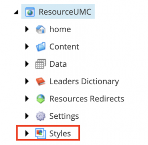
- Once you are in the Content Editor, select the ‘ResourceUMC’ from the file tree and you will see the ‘Styles’ folder item.
Applying Styling to Buttons
1. Open up a piece of content under the site item that you are working with. In this tutorial, we will be using UMC.
2. Once you have selected the content item that you will be working with, go to ‘Publish’ > ‘Experience Editor’ to open up the Experience Editor in a new window. (Make sure that you actually click on the content item you are working with before opening up Experience Editor. Sometimes there is a slight delay in page load after you click the content item. You can ensure that you are on the selected content when the content item’s title is showing in the content section).
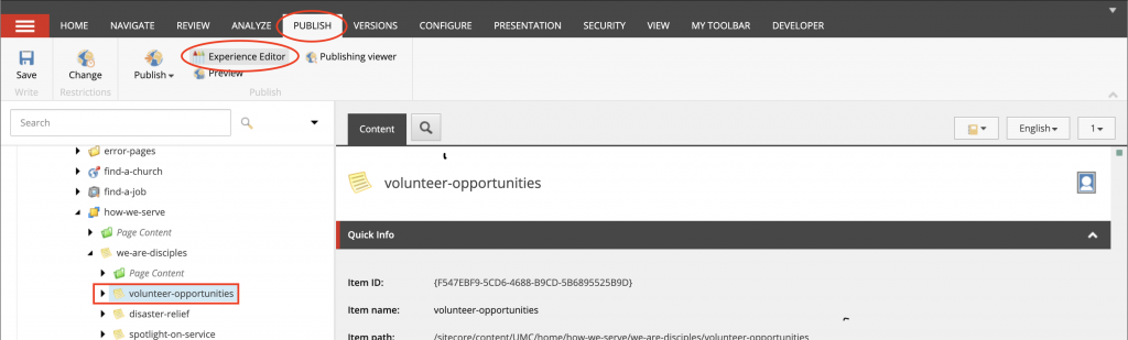
3. When Experience Editor opens, select an available Placeholder section to add a button rendering to.
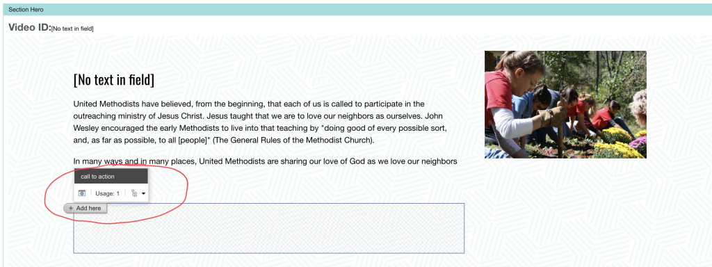
Note: Sometimes you can add a component inside of a rendering so that you can add a button rendering if a placeholder is not available.
4. Select the button rendering to add a button in the placeholder.
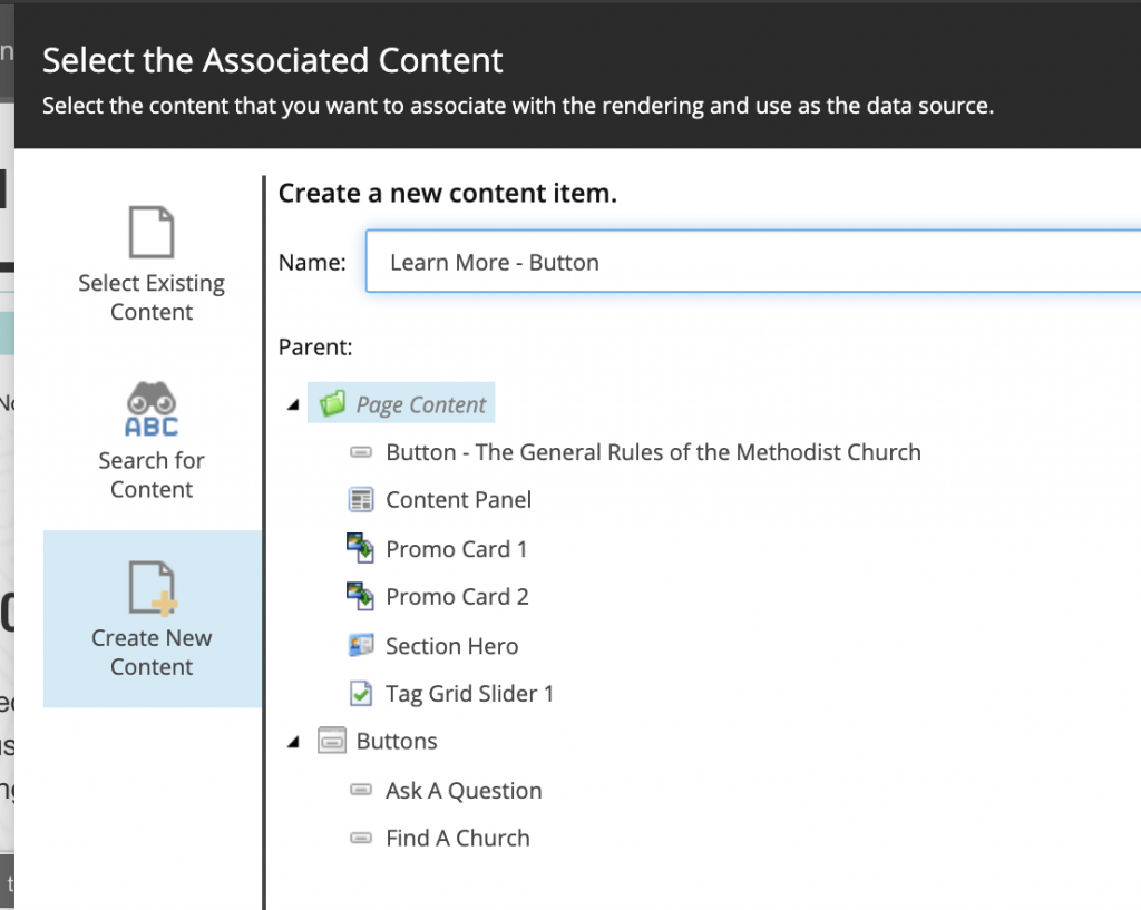
5. Select ‘Create New Content’ on the ‘Select the Associated Content’ pop-up and name the content that you’re adding; in this case we are naming ours ‘Learn More – Button’. Then click ‘OK’. It’s best practice to but the text of the button you’re intended to put on the button followed by a ‘-‘ and the type of rendering you are using, which is button in this case.
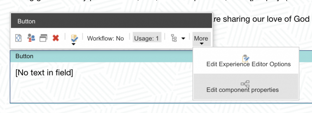
6. Once the button is applied, every rendering has a default styling. However, you are able to override this my selecting the ‘Button’ Rendering > More > Edit Component Properties.
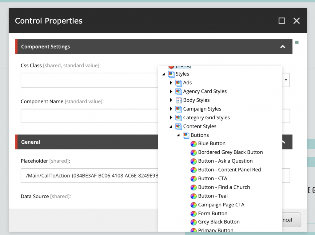
7. The Control Properties popup shows then select ‘CSS Class’ dropdown menu to add a style. The dropdown will show the file tree again and browse to Styles > Content Styles > Buttons then the style you want to apply. In this case we want ‘Button – Teal’. Then click ‘OK’.
8. The Experience Editor will take a moment to apply the style. After the page completely loads the style, click on the ‘[No Text In Field]’ section to update the text of the button.
9. Click the link  icon.
icon.
10. In the ‘Link Description’ you will place the text to you want to show on the button.
11. In the ‘Anchor’ field, you will select a link. Please ensure you are selecting an Internal Link, Media Link, or External Link so Sitecore knows how to handle the link. If the page is ever an External Link, it’s a good idea to set the ‘Target Window’ to New Browser to allow the browser to open the link in a new window. For an Internal Link, just leave the Target Window to Active browser.
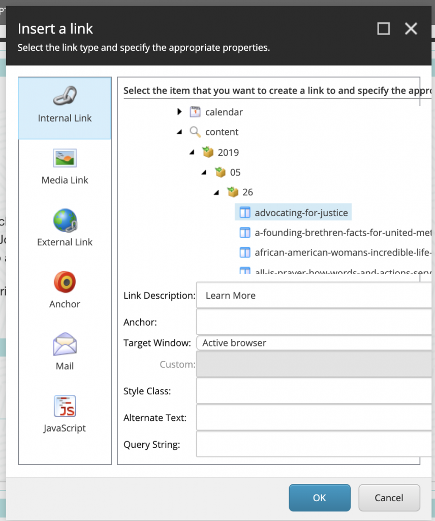
12. After the Link Description and Anchor are filled out and completed, click ‘OK’.
13. Allow Experience Editor to update the button style
14. Save
15. Go to ‘Publish Items’ and adjust the appropriate checkboxes for the publish properties.
16. Visit the page on the front-facing site to ensure the style is applied and if so you have successfully added a style to a button.